Simulate a phenotyping experiment
3rd March 2025
I am a big believer that taking the time to design an experiment properly pays big dividends down the line when it comes to analyse the data. In this post I want to illustrate how one might go about simulating a randomised phenotyping experiment.
There are some very good reasons for doing this:
- This is a good way to see how an experiment actually comes together.
- This is a good way to understand what you are doing because you can’t write the simulation unless you know what the structure is. (In fact, in writing this post I realised I had overlooked something in my real analysis, which goes to show that this works!)
- I want to use this example to illustrate some downstream analyses in future posts, and using simulations mean that we will check we got the correct answer.
A concrete experimental example
I am working on a project that compares a set of 211 parental lines of A. thaliana to two cohorts of 206 and 205 lines of their F9 progeny that had been through one round of random mating to reduce linkage disequilibrium. Last year I did an experiment to quantify some phenotypes for those 622 lines.
- There are 622 lines
- In three cohorts
- I grew three replicates per line (this is as many as would fit in a growth chamber)
- Pots were placed in 39 trays, with 48 pots per tray.
- I randomised the position of the 622 lines within replicates
The phenotype of any single plant depends on five things:
- Genetic differences between cohorts
- Genetic differences between lines within cohorts
- Environmental differences between replicates, because I sowed them separately.
- Differences between pots in the same tray, because they share an environment.
- Differences between individuals not due to the previous things (sometimes called ‘residual errors’).
In a later post we will see how to delineate those things using linear models, but for now we will generate some data.
Experimental layout
I will use the tidyverse package for R for these simulations.
This code loads the package and sets the random seed. This ensures that if we run this code again we will get the same data from the commands to random-number generators.
library(tidyverse)
set.seed(638)
Create a table with a row for each line, indicating line name and cohort.
# Table of line names and cohorts
lines <- tibble(
  cohort = c( rep("cohort1", 211), rep("cohort2", 206), rep("cohort3", 207) )
) %>%
  mutate(
    line = paste0(cohort, "_", 1:length(cohort))
  )
# Print the first 6 lines
head(lines)
 # A tibble: 6 × 2
   cohort  line
   <chr>   <chr>
 1 cohort1 cohort1_1
 2 cohort1 cohort1_2
 3 cohort1 cohort1_3
 4 cohort1 cohort1_4
 5 cohort1 cohort1_5
 6 cohort1 cohort1_6
There is a row for each line.
nrow(lines)

 [1] 624
Take that table of lines and randomise the order. Do that separately for replicates one to three, and add a column with the replicate ID. It is important that the order of randomisation be different in the three replicates.
    nreps <- 3
    exp_design = vector('list', nreps) # An empty list
    # Randomise the order of lines in each replicate
    for (r in 1:nreps){
      exp_design[[r]] <- lines[sample(1:nrow(lines)),] %>%
        mutate(replicate = r)
    }
    exp_design <- bind_rows(exp_design)

    # Print the first 6 lines
    head(exp_design)
     # A tibble: 6 × 3
       cohort  line        replicate
       <chr>   <chr>           <int>
     1 cohort1 cohort1_15          1
     2 cohort1 cohort1_53          1
     3 cohort1 cohort1_124         1
     4 cohort3 cohort3_506         1
     5 cohort3 cohort3_593         1
     6 cohort3 cohort3_518         1
There are 1872 lines, which is 3*622
nrow(exp_design)
[1] 1872
Add a column giving the tray that each pot should be placed in. 1872 pots fit neatly into 39 trays of 48, so this is as simple as replicating each of the numbers one to 48 39 times.
    ntrays <- 39
    exp_design <- exp_design %>%
      mutate(
        tray = rep(1:ntrays, each=48)
        )
We now have a table indicating where each pot in the experiment needs to go.
Simulate effects
We need to simulate effects of being a plant of each line, in each cohort, in each tray, in each replicate. We will do this with a series of tables for each, then use join them. There are actually much less verbose ways to do this in R, but I will use the tidyverse way because it offers a way to do this which is clear and robust.
The following code creates a table with a row for each cohort, and an ‘effect’ for each drawn from a normal distribution with a standard deviation of 0.01.
    cohort_effects <- tibble(
      cohort = unique(exp_design$cohort),
      cohort_effect = rnorm(n=3, sd=0.01)
    )
    cohort_effects
     # A tibble: 3 × 2
       cohort  cohort_effect
       <chr>           <dbl>
     1 cohort1      0.0167
     2 cohort3      0.000591
     3 cohort2     -0.00443
This means that individuals in cohort 1 will have a phenotype that is on average 0.0167 higher than the mean, those in cohort 2 will be 0.000591 above the mean, and those in cohort 3 will be 0.0043 below the mean.
The following code does the same for the three replicate cohorts, the 624 lines and the 39 trays
    replicate_effects <- tibble(
      replicate = 1:nreps,
      replicate_effect = rnorm(n=nreps, sd=0.2)
    )

    genetic_effects  <- tibble(
        line = lines$line,
        genetic_effect = rnorm(n=nrow(lines), sd=0.5)
      )

    tray_effects <- tibble(
      tray = 1:ntrays,
      tray_effect = rnorm(n=ntrays, sd = 0.1)

    )
It’s worth clarifying what the genetic effects mean because that’s what
we are really interested. genetic_effects has a row for each line with
a column of values for each line. These values represent the expected
deviation for each line from the mean. The variance between these values
is the genetic variance. Dividing this number by the overall variance is
the estimate of broad-sense heritability.
head(genetic_effects)
     # A tibble: 6 × 2
       line      genetic_effect
       <chr>              <dbl>
     1 cohort1_1         0.302
     2 cohort1_2         0.192
     3 cohort1_3         0.672
     4 cohort1_4         0.479
     5 cohort1_5        -0.0843
     6 cohort1_6         0.413
Simulate a phenotype
Using a join command is a robust way to merge these tables. The
following code adds effects for cohort, replicate, line and tray to the
table of 1872 individual plants. Take a look at it and convince yourself
that plants of the same replicate have the same replicate effect, and
those of the same line have the same line effect, and so forth.
    exp_design <- exp_design %>%
      left_join(cohort_effects, by = "cohort") %>%
      left_join(replicate_effects, by ='replicate') %>%
      left_join(genetic_effects, by='line') %>%
      left_join(tray_effects, by = 'tray')
The only thing left to do is to add up these effects, and add some residual variance.
    exp_design <- exp_design %>%
      mutate(
        normal_phenotype = cohort_effect + replicate_effect + genetic_effect + tray_effect + rnorm(nrow(exp_design), 0.19)
      )
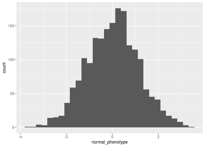
If we plot a histogram we can see we have a normally distributed phenotype as one would expect.
    exp_design %>%
      ggplot(aes(x = normal_phenotype)) +
      geom_histogram()

     `stat_bin()` using `bins = 30`. Pick better value
     with `binwidth`.